Chapter 5: Scalar Visualization
Scenarios
Below are several scenarios covering the scalar visualization techniques described in Chapter 5. As always, make sure to study also the source code samples for Chapter 5, which illustrate complementary methods and techniques for scalar visualization.
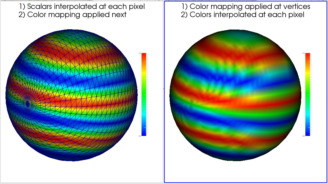
Color mapping and color interpolation
This scenario demonstrates the difference between
- applying color mapping at a grid's vertices, and using color interpolation next
- applying scalar interpolation at each pixel, and color mapping next
As visible, the second option produces far less interpolation artifacts.
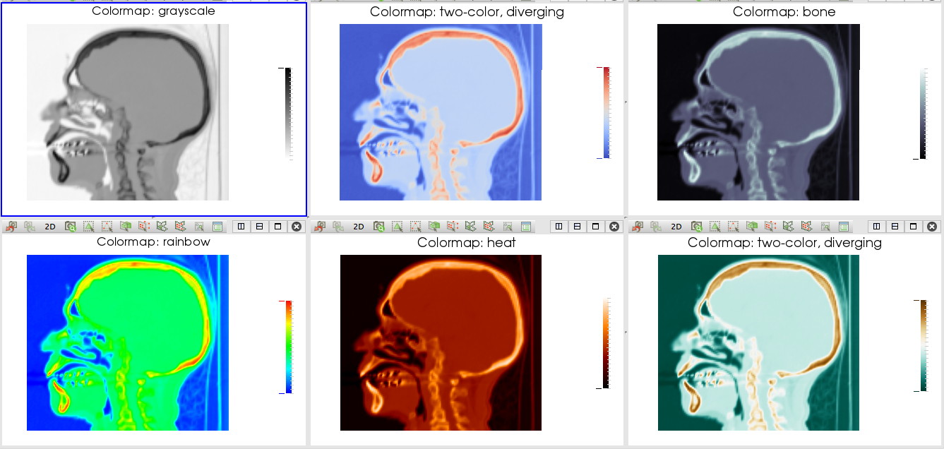
Colormap variations
This scenario demonstrates the usage of various colormaps for a 2D scalar dataset. Clearly, different colormaps succeed differently in emphasizing specific features present in the data. Explore this issue further by e.g. using different datasets or different colormaps (from the presets offered by ParaView).
Warping
This scenario demonstrates the usage of warping as a technique to visualize scalar values over a 3D surface. Additionally, color mapping is used to emphasize the scalar values.
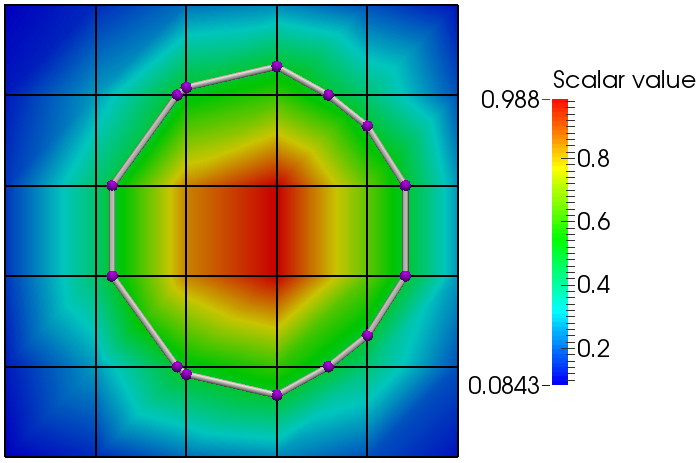
Isoline construction
This scenario demonstrates the construction of 2D isolines. A simple 2D scalar signal over an uniform grid is used to illustrate the isoline construction. Color mapping is also added to show the correlation between color interpolation and isoline structure.
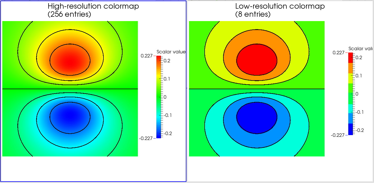
Isolines and colormaps
This scenario demonstrates the relationship between isolines and color maps. We visualize a 2D scalar dataset using isolines and also a high-resolution and a low-resolution colormap. We see low the color discontinuities of the low-resolution colormap correspond to the locations of the isolines.
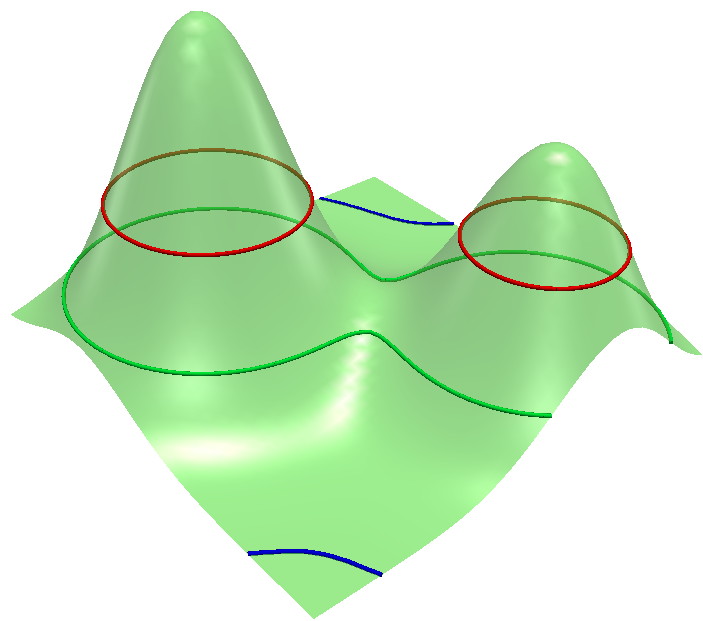
Isolines and height plots
This scenario demonstrates the relationship between isolines of a 2D function and its height plot. We see how the respective isolines are equivalent to horizontal (xy plane) slices of the height plot.
Dense iso-slices
This scenario demonstrates the relationship between isolines and isosurfaces. Given a 3D volume, we extract a number of densely spaced parallel planar slices. For each slice, we next extract an isoline at the same scalar value. Rendering all these isolines conveys an impression of the 3D isosurface corresponding to the same scalar value.
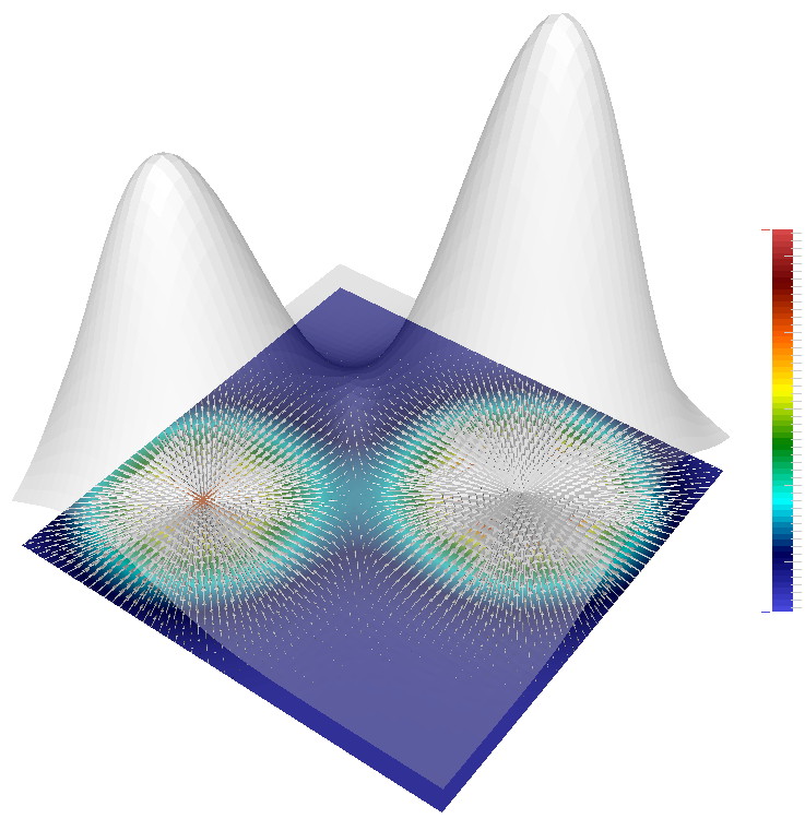
Gradients and height plots
This scenario demonstrates the relationship between the gradient of a 2D function and its height plot. We see how, at each point in the function's domain, points in the direction of fastest increase of the function at that point, as shown by the height plot.
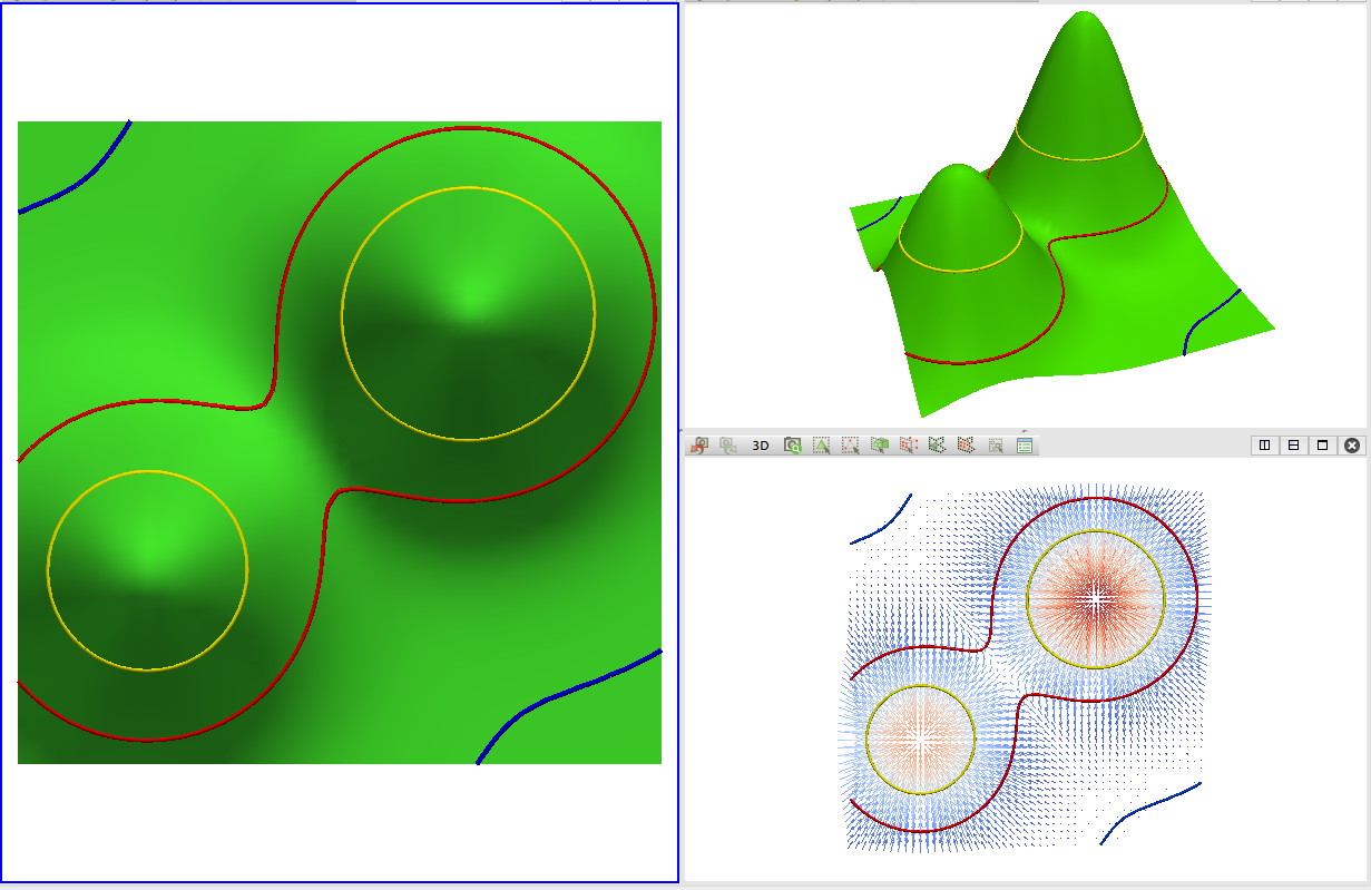
Gradients, height plots, and isolines
This scenario combines the previous two scenarios to show the relationships between the plot of a 2D function, its gradient, and its isolines.
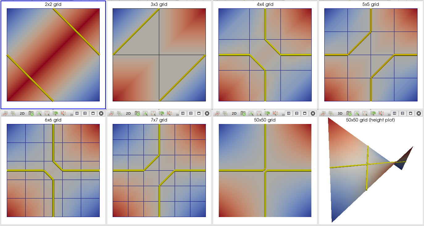
Contour ambiguities
This scenario illustrates the potential contour ambiguities existing in the neighborhood of saddle points of the contoured scalar signal. The sample shows how the contours change in the respective neighborhood as the sampling rate of the scalar signal changes.
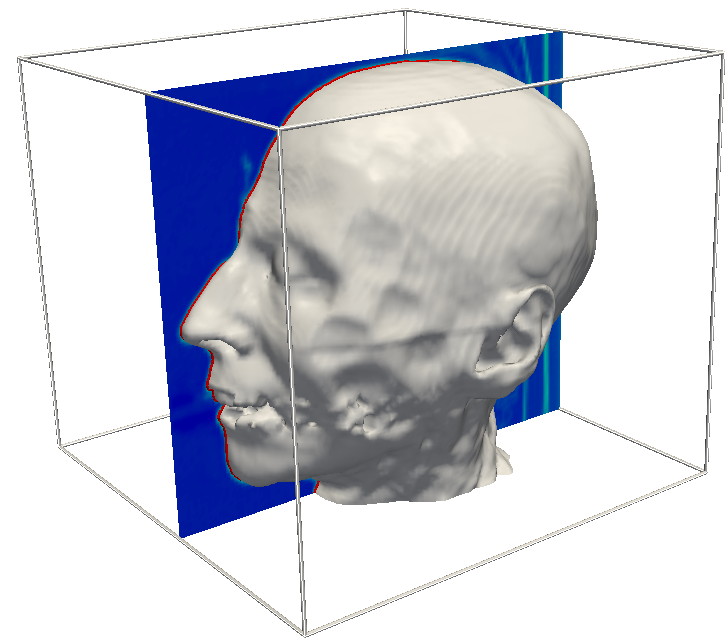
Isosurfaces and slicing
This scenario illustrates the relationship between slicing and isosurfacing. Specifically, it show that a slice through an insosurface (of a 3D scalar dataset) is equivalent to an isosurface of a slice (from the same 3D dataset).
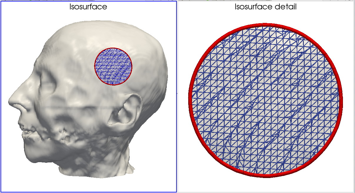
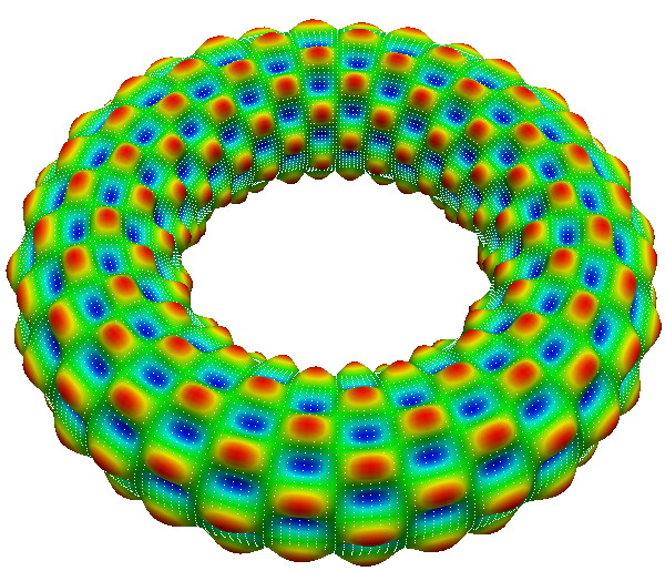
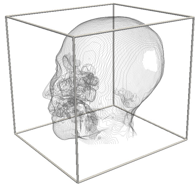
Isosurface artifacts
This scenario illustrates the structure of artifacts (caused both by data acquisition issues and isosurface extraction algorithm limitations) in isosurfaces.